|
|
||
| You are here: Department of Informatics > Visualization Group > Teaching > INF219: Project in Visualization > Fall 2008 > Andreas Lie | ||||||||||||||||||||||||||||||||||||||||
|
Andreas Lie: Using Superellipse Glyphs To Visualize n-Dimensional Data in SimVis Glyphs have proven to be a very effective in displaying n-dimensional datasets. The task given in this INF 219 project was to construct a glyph capable of displaying data for several attributes simultaneously, and implement this glyph. The framework in question, SimVis, is a sophisticated tool for data mining in n-dimensional datasets. This framework already has strong statistical functionalities, but lacks a proper Glyph based rendering to support visualization of the data. By externalizing the glyphs, embedding them in an image, different glyph designs could easily be interchanged with no changes needed to the framework itself. The results of this project have been published as:
Screenshots
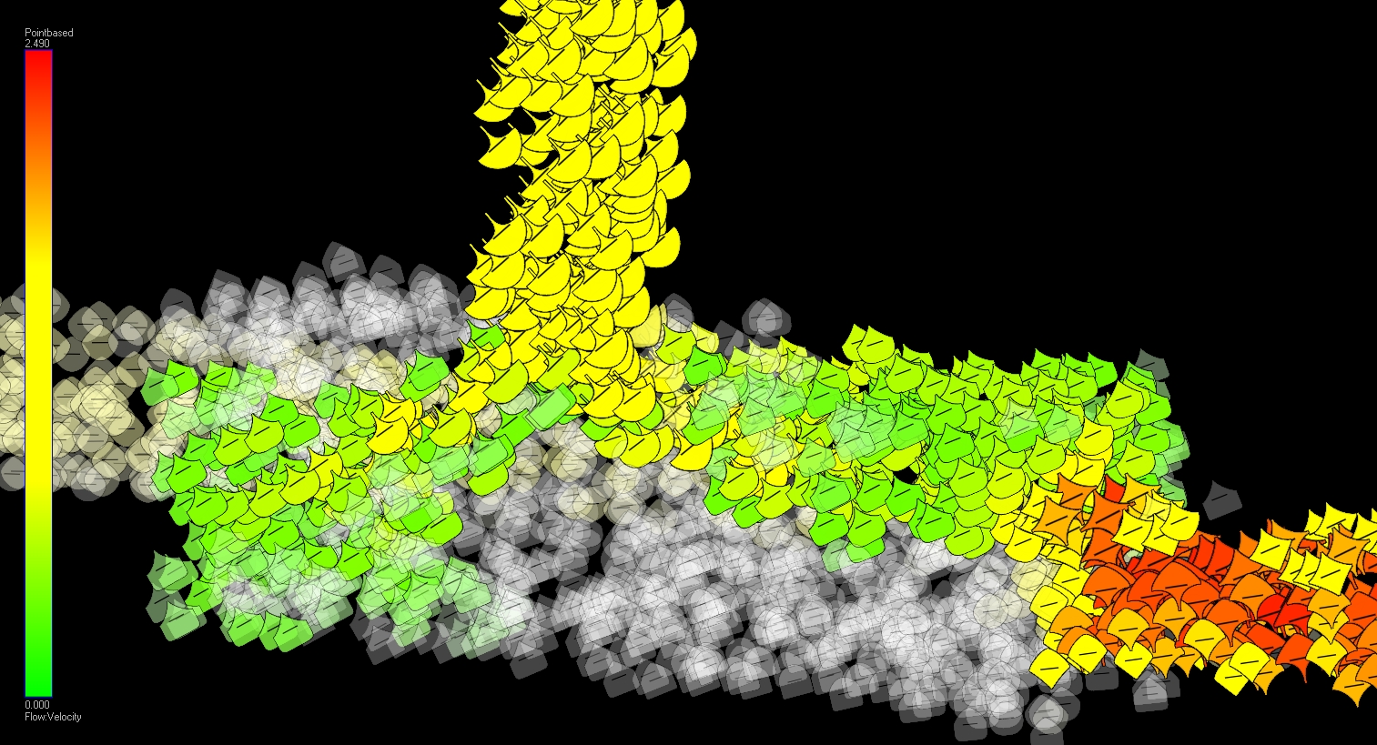
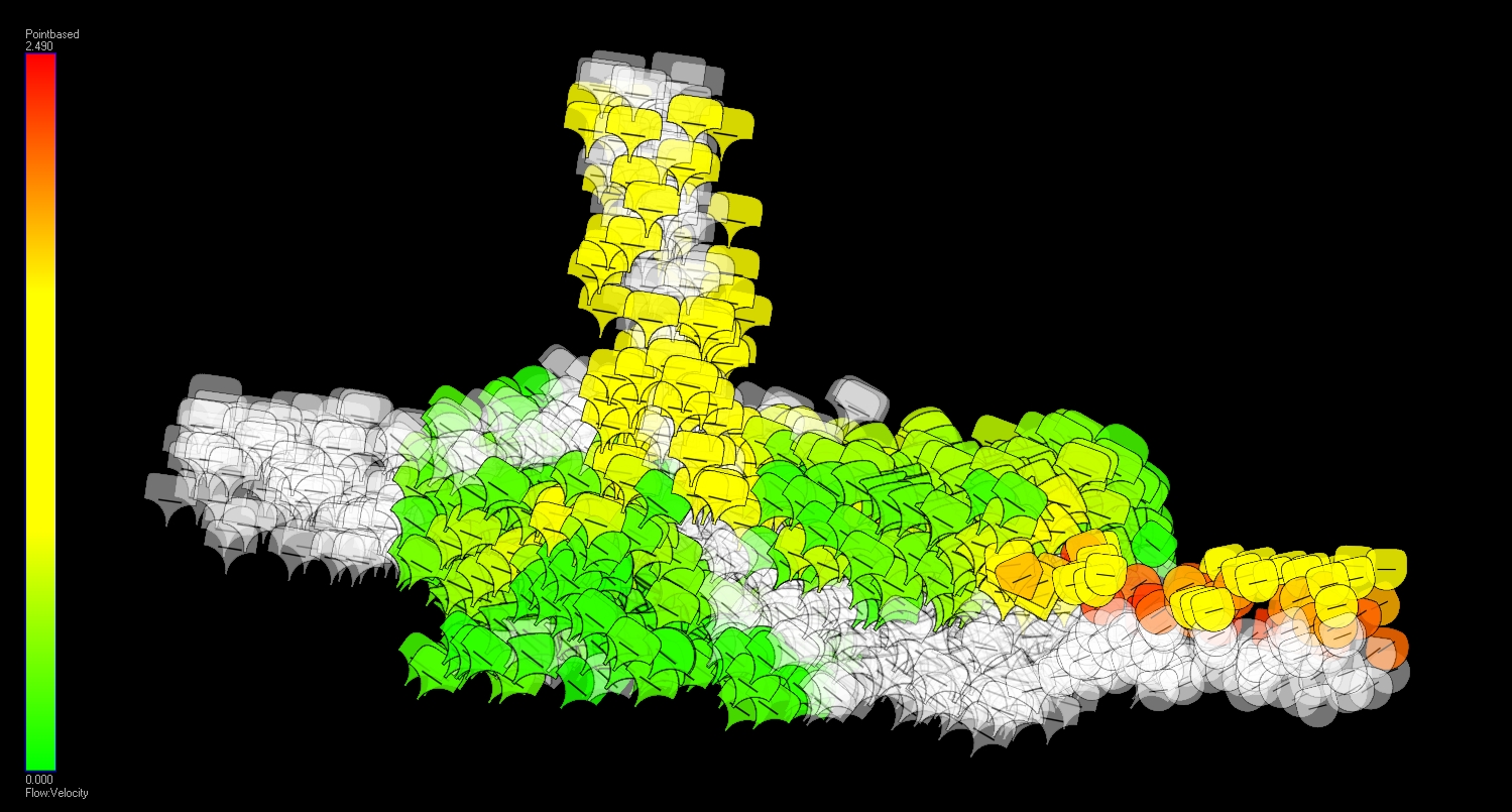
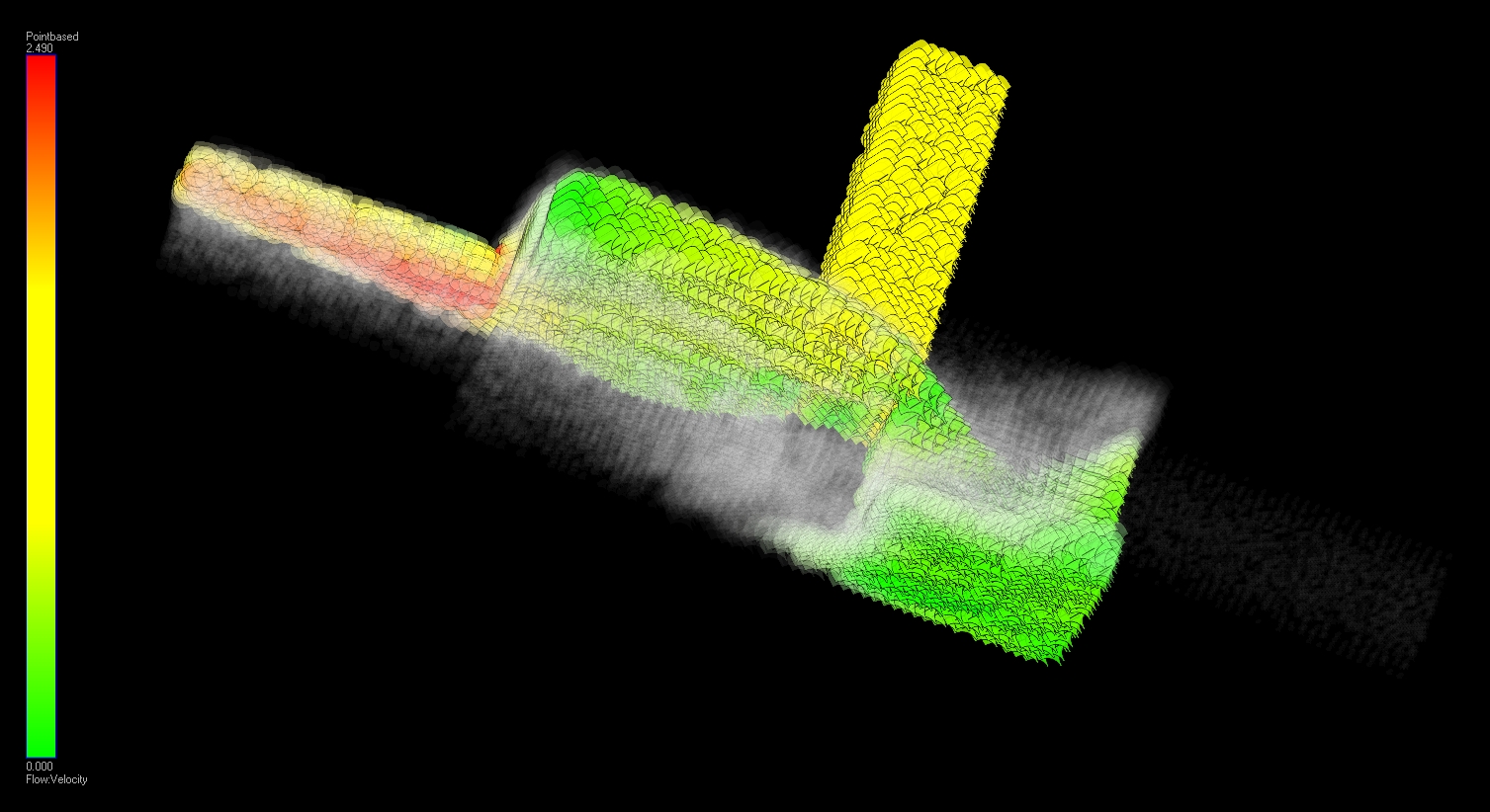
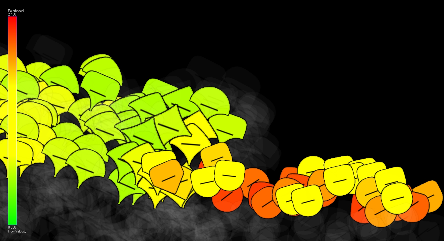
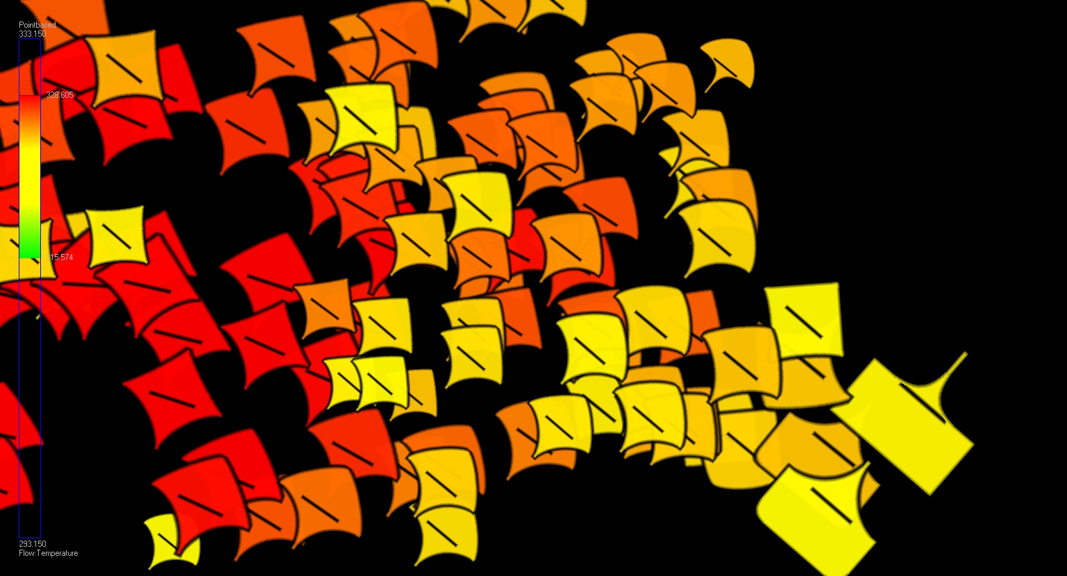
This is the Connect dataset, where two fluids are mixed in a t-junction. Color is mapped to temperature, upper exponent to dissipation rate and the lower exponent to relative pressure. The size of the glyphs is mapped to velocity and the rotation again to temperature. Most value ranges have undergone exponentiation (not linearly mapped) and is windowed to some degree. 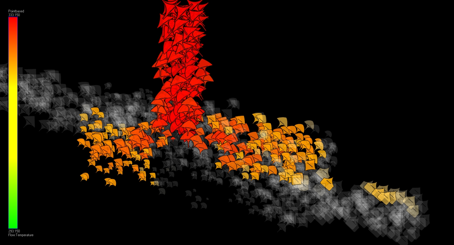
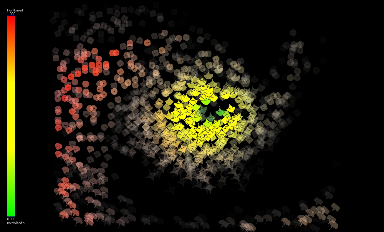
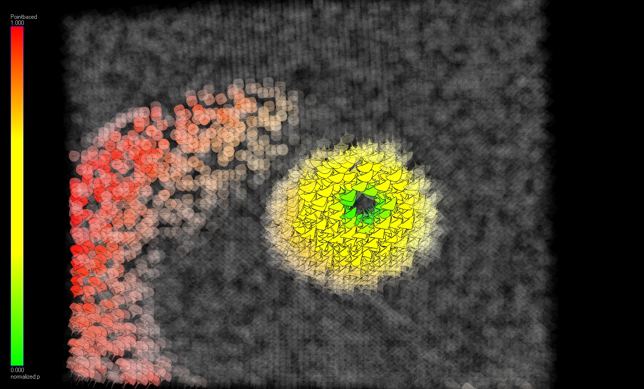
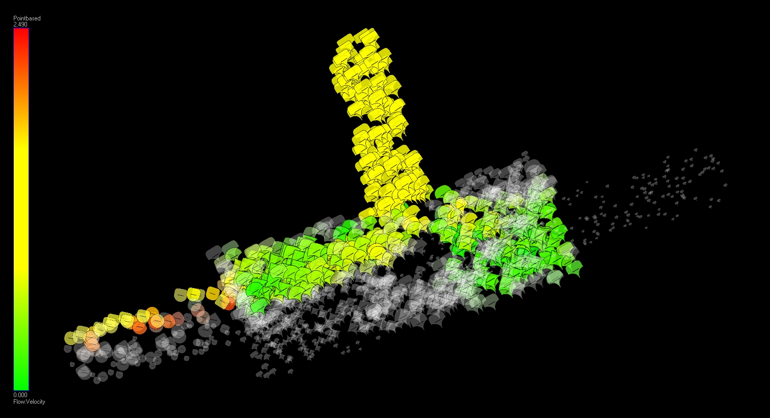
In this visualization you can see a timestep in the isabel hurricane. Color is mapped to normalized precipitation, the exponent controlling the glyphs upper part is mapped to normalized temperature. The lower exponent to normalized pressure and the rotation is mapped to water vapor (qvapor). 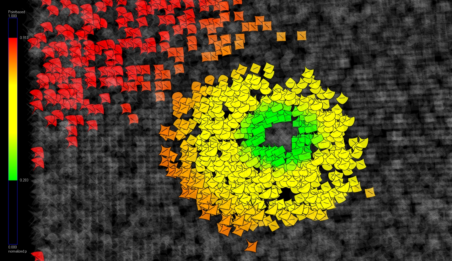
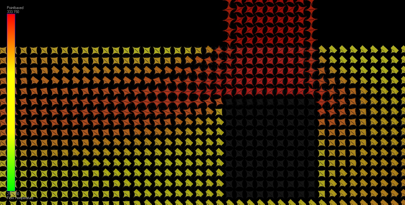
This is the atlas used to visualize the data. Quadrants of calculated superellipses are sewn together to form the glyphs. The atlas itself is constrained to a size, and what number of quadrants contained, but not to its glyphs displayed, enabling new atlases easy to import into the glyphrenderer. 
Resources Project report Movie #1 Movie #2 Movie #3 Movie #4 |
|||||||||||||||||||||||||||||||||||||||